original source : bittbox
I want to show you one that I use often. I would only assume that as designers, we would typically have our rulers turned on most of the time. (I’ve tested this as far back as CS1) To access your Photoshop preferences quickly, just double-click on a ruler! That’s it!
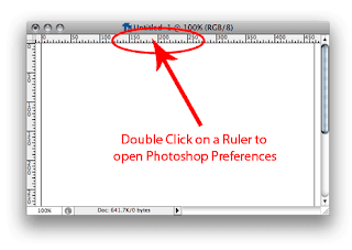
The preference pane will open in the “Units & Rulers” section, which makes sense:
For whatever reason, this does not work in Illustrator. Man, a little consistency would be nice . . .
Read More ...
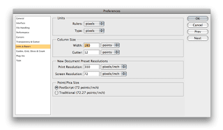
I want to show you one that I use often. I would only assume that as designers, we would typically have our rulers turned on most of the time. (I’ve tested this as far back as CS1) To access your Photoshop preferences quickly, just double-click on a ruler! That’s it!
The preference pane will open in the “Units & Rulers” section, which makes sense:
For whatever reason, this does not work in Illustrator. Man, a little consistency would be nice . . .